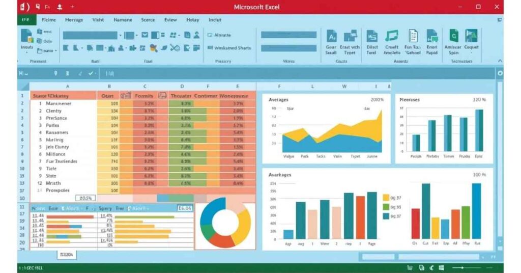
Excel Charting and Visualization Techniques – Turn Data into Stories
Introduction
Data is powerful, but raw numbers alone don’t always make sense. Humans understand visuals faster than rows and columns of figures. That’s where charts and data visualization in Excel come in.
Charts transform complex data into easy-to-read visual stories, helping businesses, students, and professionals make better decisions. From a simple bar chart to advanced combo charts, Excel offers a wide range of visualization tools.
In this blog, we’ll explore Excel charting and visualization step by step — from basics to advanced techniques, with examples explained in simple, layman’s words.
Table of Contents
1. Why Use Charts in Excel?
Imagine you have monthly sales data of 12 months. Which is easier?
- Looking at a table of numbers.
- Or seeing a graph showing growth and decline trends.
Charts help you:
- Understand patterns and trends quickly.
- Compare different sets of data.
- Highlight key insights (growth, decline, differences).
- Present reports more professionally.
2. Types of Charts in Excel
Excel offers more than 20 chart types. Let’s break them into categories:
a) Column and Bar Charts
- Column Chart – Vertical bars showing comparison.
- Bar Chart – Horizontal bars, useful for long labels.
✔ Best for comparing categories like sales by product, students’ marks, or expenses.
b) Line and Area Charts
- Line Chart – Shows trends over time.
- Area Chart – Same as line but filled with colors for impact.
✔ Best for analyzing stock prices, monthly sales, or website visitors.
c) Pie and Donut Charts
- Pie Chart – Circular chart showing proportions.
- Donut Chart – Same as pie but with a hole in the middle.
✔ Best for showing percentages like market share, budget allocation.
d) Scatter and Bubble Charts
- Scatter Chart – Plots points on X & Y axis, shows relationship between variables.
- Bubble Chart – Same as scatter but bubbles’ size shows extra data.
✔ Best for correlation (e.g., hours studied vs. exam scores).
e) Combo Charts
- Combine two charts (e.g., column + line).
✔ Useful when you want to compare sales numbers (columns) with growth trend (line).
f) Special Charts
- Histogram – Shows frequency distribution.
- Waterfall Chart – Visualizes increase/decrease step by step.
- Funnel Chart – Shows stages in a process (sales funnel).
- Radar Chart – Compares multiple variables.
3. How to Create a Chart in Excel
Step-by-step guide:
- Select your data (including headers).
- Go to Insert Tab → Charts group.
- Choose chart type (column, line, pie, etc.).
- Excel generates the chart instantly.
✔ Tip: Always check if the chart type matches the message you want to deliver.
4. Customizing Charts
A raw chart is not enough. You must customize for clarity and attractiveness.
a) Add Titles and Labels
- Chart Title → Explain what chart represents.
- Axis Titles → Label X and Y axis clearly.
- Data Labels → Show exact numbers on bars/lines.
b) Change Colors and Styles
- Use Format Tab to choose colors.
- Stick to 2–3 consistent colors for readability.
- Highlight important data with a different color.
c) Legends
Legends explain what each color/line represents.
- Place at top/right/bottom for clarity.
- Avoid clutter.
d) Gridlines and Background
- Remove unnecessary gridlines for cleaner look.
- Use light background for professional visuals.
5. Best Chart for Different Scenarios
- Compare Sales of Products → Column/Bar Chart
- Monthly Growth Over Time → Line Chart
- Market Share Distribution → Pie/Donut Chart
- Survey Results (How many people chose A, B, C) → Bar Chart
- Profit and Loss Analysis → Waterfall Chart
- Performance Across Multiple Skills → Radar Chart
6. Advanced Excel Charting Techniques
a) Combination Chart
Example: Show Sales (Column) + Growth % (Line) in one chart.
Steps:
- Insert a chart → Choose Combo Chart.
- Assign first data to column, second to line.
b) Secondary Axis
If two data sets have different scales (e.g., revenue in millions vs. units sold in thousands), use a secondary axis.
- Right-click series → Format Data Series → Secondary Axis.
c) Dynamic Charts with Named Ranges
Make charts update automatically when new data is added.
- Define a named range (using OFFSET/INDEX).
- Use that range as chart source.
d) Sparklines
Tiny charts inside a cell.
Insert → Sparklines → Line/Column/Win-Loss.
✔ Great for dashboards.
e) Conditional Formatting with Charts
- Use bar charts inside cells with conditional formatting.
- Creates mini visualizations without full charts.
f) Using Shapes and Icons
Enhance visuals by adding:
- Arrows for growth/decline.
- Icons for categories.
- Callouts for highlighting points.
7. Power of PivotCharts
PivotCharts are linked with PivotTables.
- Quickly summarize and visualize large data.
- Drag-and-drop fields to update charts.
- Easy filtering using slicers.
✔ Example: Visualize sales by region and month dynamically.
8. Interactive Dashboards with Charts
Dashboards = Multiple charts + interactivity.
Techniques:
- Use Slicers & Timelines for filtering.
- Combine multiple charts in one sheet.
- Apply consistent formatting.
✔ Example: Sales Dashboard → Bar chart for product sales, Line chart for monthly trend, Pie chart for region share.
9. Common Mistakes in Charting
- Using wrong chart type (e.g., Pie for too many categories).
- Overusing colors (rainbow effect).
- Adding too much data → Clutter.
- No labels → Reader gets confused.
- Ignoring context → Chart tells half story.
10. Tips for Professional Excel Charts
- Keep charts simple and focused.
- Highlight the key message.
- Use consistent colors (brand theme if possible).
- Don’t overcrowd with text.
- Always double-check accuracy of data.
11. Real-Life Example
Suppose you run an online store and want to analyze performance.
Dataset:
- Monthly sales (Jan–Dec).
- Customer type (New/Returning).
- Top 5 products.
Visualization Approach:
- Line Chart → Show monthly sales growth.
- Pie Chart → Market share of top 5 products.
- Bar Chart → Compare new vs. returning customers.
- Combo Chart → Revenue (bars) + Growth % (line).
- Combine all → Interactive dashboard.
Now your messy numbers become a clear business story.
12. Best Practices for Data Visualization in Excel
✔ Choose chart type wisely.
✔ Stick to 2–3 main colors.
✔ Add labels for clarity.
✔ Use legends smartly.
✔ Avoid 3D charts (hard to read).
✔ Test readability (would a beginner understand?).
Conclusion
Excel charts are not just about making data look pretty — they are about telling a story.
From simple bar and line charts to advanced dashboards with slicers, Excel gives you all the tools you need to transform boring numbers into meaningful insights.
If you’re new, start with column and pie charts. As you grow, explore PivotCharts, Combo charts, and Dashboards.
👉 Remember: A good chart doesn’t just show data, it explains the message behind the data.

