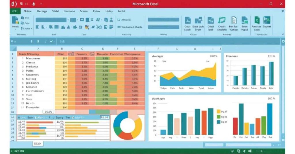
Excel Dashboard & Visualization Techniques: Charts, Conditional Formatting & Interactive Reports
Creating an Excel sheet is one thing, but making it visually appealing, interactive, and insightful is what separates a normal spreadsheet from a professional dashboard.
Table of Contents
In this blog, we’ll explore:
- Charts and Graphs
- Conditional Formatting
- Slicers and Timelines
- Interactive Dashboards
- Practical Tips for visualization
🔹 Why Dashboards & Visualization Are Important
- Transform raw data into insights at a glance
- Identify trends, patterns, and anomalies quickly
- Help managers and stakeholders make data-driven decisions
- Make reports interactive for exploring data without changing the source
👉 Example: Instead of showing a 5,000-row sales table, a dashboard with charts and slicers can instantly show top-selling products, regional performance, and monthly trends.
🔹 Charts in Excel
Charts are the most basic yet powerful visualization tool in Excel.
📌 Types of Charts
- Column/Bar Chart → Compare values across categories.
- Line Chart → Show trends over time.
- Pie/Donut Chart → Show proportion or percentage of categories.
- Area Chart → Highlight cumulative trends.
- Combo Chart → Combine column and line for advanced comparisons.
- Scatter Chart → Visualize correlation between variables.
- Waterfall Chart → Show incremental changes.
🔹 Example: Sales Trend
- Select monthly sales data.
- Insert → Line Chart → Shows monthly revenue trend.
- Format chart → Add title, data labels, and color for clarity.
Charts make complex numbers easy to understand.
🔹 Conditional Formatting
Conditional Formatting highlights cells based on criteria, making patterns or anomalies easy to spot.
📌 Common Uses
- Highlight top/bottom values → Identify best/worst products.
- Color scales → Show trends from low to high values.
- Icon sets → Use arrows, flags, or traffic lights to indicate performance.
- Custom formulas → Apply formatting based on specific rules.
🔹 Example: Highlight Low Sales
- Select sales column.
- Home → Conditional Formatting → Highlight Cells Rules → Less than 500 → Red fill.
- Cells with sales <500 are instantly highlighted.
This helps quickly identify underperforming products or regions.
🔹 Slicers & Timelines
Slicers and Timelines make Pivot Tables and Charts interactive.
- Slicers → Filter by category (e.g., Region, Product, Department) with clickable buttons.
- Timelines → Filter by dates (e.g., Month, Quarter, Year).
🔹 Example: Interactive Sales Dashboard
- Create Pivot Table → Summarize sales by Region & Product.
- Insert Slicer → Add buttons for Region.
- Insert Timeline → Filter by Month.
- Charts connected to Pivot → Update instantly when slicer/timeline changes.
Now, the dashboard is fully interactive without manually changing filters.
🔹 Creating an Interactive Dashboard
Step-by-step process:
- Prepare Data → Clean using Power Query (remove duplicates, fix column types).
- Build Pivot Tables → Summarize key metrics (Revenue, Profit, Quantity).
- Insert Charts → Use column, line, and combo charts for trends.
- Apply Conditional Formatting → Highlight top performers or low performers.
- Add Slicers/Timelines → Make the dashboard interactive.
- Arrange Layout → Use grid layout and consistent color scheme.
- Protect Worksheet → Lock formulas and charts for professional presentation.
🔹 Tips for Effective Dashboards
✅ Keep it simple → Avoid clutter; focus on KPIs.
✅ Use consistent colors → Highlight trends with the same color scheme.
✅ Align charts & tables → Create a clean layout.
✅ Use dynamic ranges → Ensure charts update when new data is added.
✅ Combine with Power Query & Power Pivot → Automate updates for large datasets.
🔹 Practical Use Cases
- Sales Dashboard → Regional sales, top products, monthly trends.
- Finance Dashboard → Revenue vs. expenses, profit margins, budget comparisons.
- HR Dashboard → Employee performance, attendance trends, attrition rates.
- Marketing Dashboard → Campaign performance, lead conversion trends.
- Academic Dashboard → Student scores, pass/fail trends, subject-wise analysis.
🔹 Step-by-Step Example: Monthly Sales Dashboard
- Use Power Query → Import all regional CSVs.
- Clean & Transform Data → Remove duplicates, format numbers.
- Build Pivot Table → Revenue by Product and Region.
- Insert Column Chart → Show revenue by product.
- Insert Line Chart → Show revenue trend over months.
- Apply Conditional Formatting → Highlight low-performing regions.
- Insert Slicers & Timeline → Interactive filtering by region & month.
- Arrange layout → Align charts and pivot tables for clarity.
- Protect sheet → Prevent accidental edits.
The final result is a professional interactive dashboard that updates dynamically when new data is added.
🔹 Final Thoughts
Excel Dashboards & Visualization techniques transform raw data into actionable insights. By combining:
- Charts → Trend visualization
- Conditional Formatting → Highlighting patterns
- Slicers/Timelines → Interactive filtering
…you can create dashboards suitable for business, academic, or personal use.
Whether you’re a beginner or advanced user, mastering these techniques enhances your data analysis skills and professional efficiency.

